











“Wingman by far exceeded our expectations. I would highly recommend them to anyone looking to better market themselves. I now feel my website is top notch.”
Jana C.
Pro tip: Use responsive design to ensure your site looks great on any device, enhancing user experience significantly.
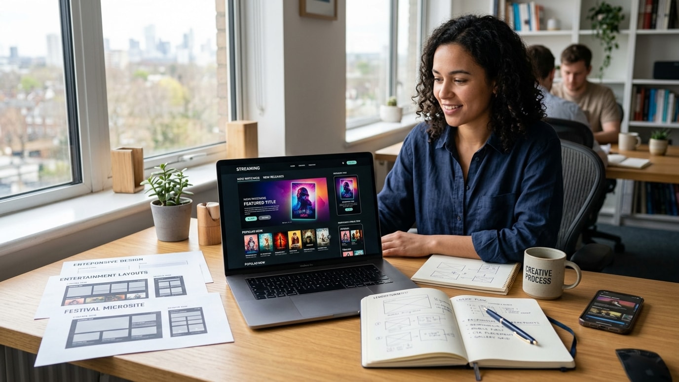
Responsive design is no longer optional in today’s web environment. For those in the entertainment industry, ensuring your website adapts seamlessly to mobile, tablet, and desktop is pivotal. As digital consumption patterns shift, leveraging responsive web design becomes essential to maintain competitiveness and audience engagement.
Responsive web design ensures that a webpage automatically adjusts and provides a smooth user experience regardless of the device screen size. For entertainment brands and professionals, this flexibility can mean better engagement, lower bounce rates, and improved visibility. A responsive site caters to users on the go, crucial for talent agencies, production companies, and entertainment venues that engage audiences through multiple touchpoints.
With more people accessing content via mobile devices, a non-responsive site risks alienating a significant portion of your audience. Imagine losing potential connections because a webpage didn't load correctly on a smartphone. Responsive design enables interactive and visually appealing experiences, fostering audience retention and loyalty.
Incorporating local SEO strategies for production vendors can help entertainment businesses connect more effectively with local audiences. Responsive design supports these strategies by ensuring that search engines accurately index your mobile content, boosting your presence in local search results.
Responsive web design relies on flexible grids, layouts, and images. The core principle involves using CSS media queries to apply different styling rules based on device features such as screen width, orientation, and resolution. This technique allows designers to build a single site that functions effectively across various platforms.
Key to its effectiveness is the use of scalable images and flexible grids. Elements within the site are sized in relative units, like percentages, rather than fixed units. This adaptability is critical in environments where users switch from one device to another quickly.
For talent and modeling agencies, responsive design can make or break a first impression. Mobile-accessible portfolio websites for performers ensure casting professionals experience effortless navigation. Additionally, production marketing strategies can deeply embed responsive elements to align marketing goals with audiences' browsing habits.
In the world of filmmaking and production, detailed project webpages are a must. A cross-device optimized site means stakeholders can share interactive event experiences effortlessly, regardless of their location. This ensures information accuracy and accessibility, critical for high-stakes projects.
Embracing custom websites for artists supports creative expression while ensuring broad audience reach. A responsive platform ensures artists' visual work remains crisp across devices, which is key to maintaining an impactful online presence.
Responsive web solutions for film projects can be deeply informative through strategically placed callouts and interactive visuals. These techniques enhance narrative storytelling while ensuring the audience enjoys an uninterrupted experience.
Insight: Prioritize mobile load speed; a faster site keeps users engaged longer.
Responsive design is essential for any entertainment industry professional aiming to connect effectively with broader audiences. By investing in this pivotal aspect of web development, businesses ensure they remain at the forefront of user engagement and digital marketing success. Stay ahead by using industry-leading practices that not only reach but impress your audience.
Ensure every user enjoys a seamless experience, regardless of their device.
Utilize flexible grids to adapt design effortlessly across devices.
Boost user satisfaction with intuitive design tailored to every platform.
Increase visibility and engagement with mobile-friendly pages.
Ensure images are clear and effective on all screens.
Rigorous testing across devices for consistent quality.